Helping sellers succeed in e-commerce
Company: eBay | Role: Lead UX Writer
Challenge
Empower sellers to quickly create compelling listings that reach the right buyers.
New and experienced sellers used the “List your item” flow to put up over 500 million items for sale each year. The listing experience is vital to eBay’s business because revenues come from listing fees and commissions on sold items.
Listing an item was hard
Sellers had to wade through several long, bloated pages.
Each section on a page seemed to have its own structure and conventions. Labels didn’t match what sellers called things. And there was too much information being thrown to the user at once. Though the intention was to help sellers make good choices, they reported feeling overwhelmed and confused.
The completion rate of the listing flow was 75% for experienced sellers and 25% for new sellers. For those who managed to get to the end, the average completion time was over an hour.
Solution
Redesign the listing experience, including UI and Help content.
Our cross-functional team overhauled the "List your item" flow to be shorter, simpler, and more capable of giving sellers information when they needed it.
Content process and samples are below.
Outcome
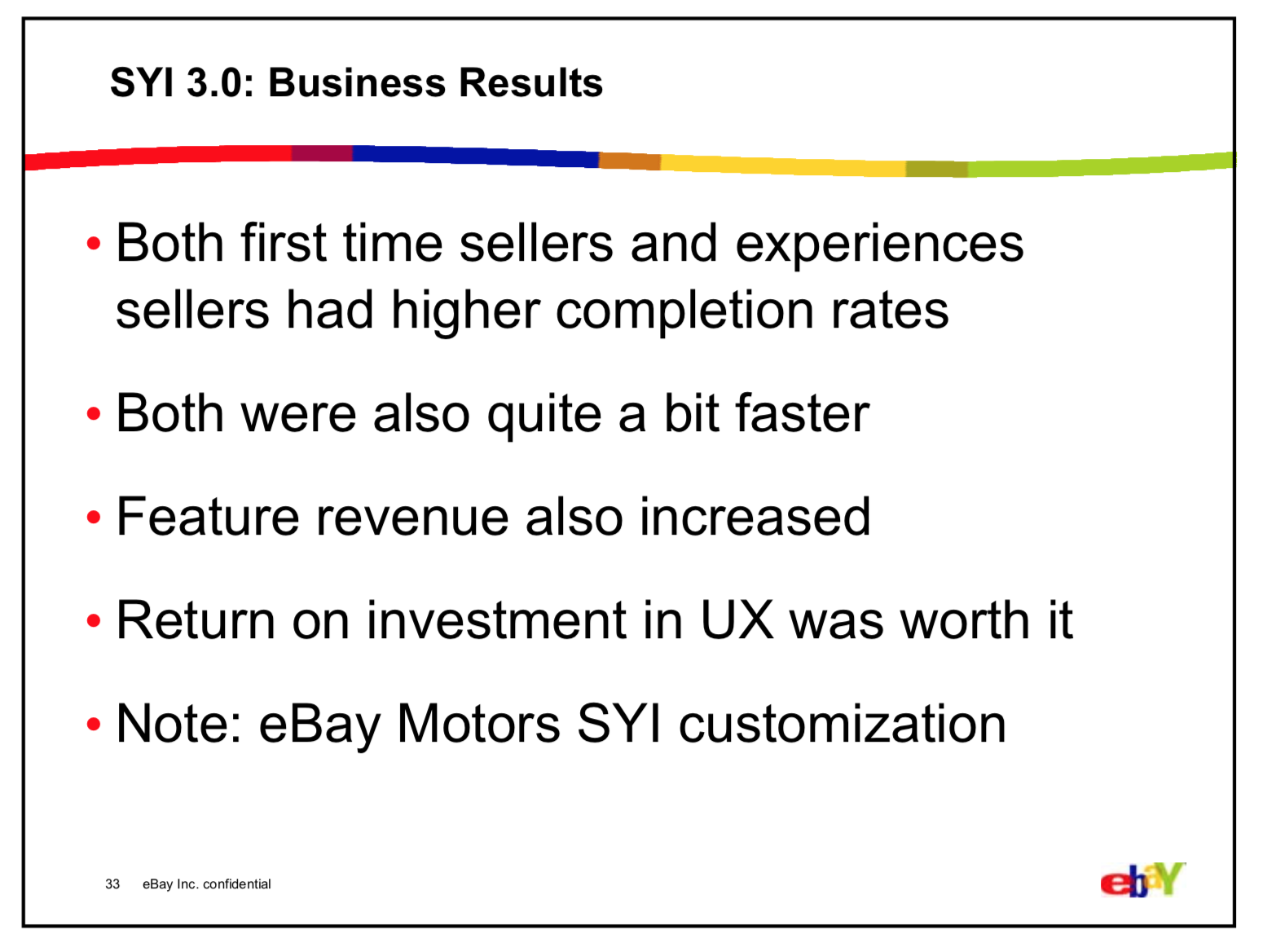
Mission accomplished.
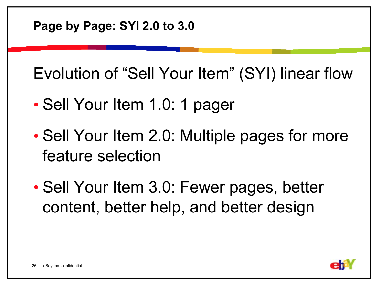
I wish I had the “after” metrics! All I could find was this summary from a 2007 talk by Christian Rohrer. He was the Director of User Experience Research, so we can be confident that he had the data to back it up. :)
Slide from presentation by Christian Rohrer (then Director of eBay UER) at UIE Web App Summit, January 23, 2007.
Process and samples
Sellers were the center of our world
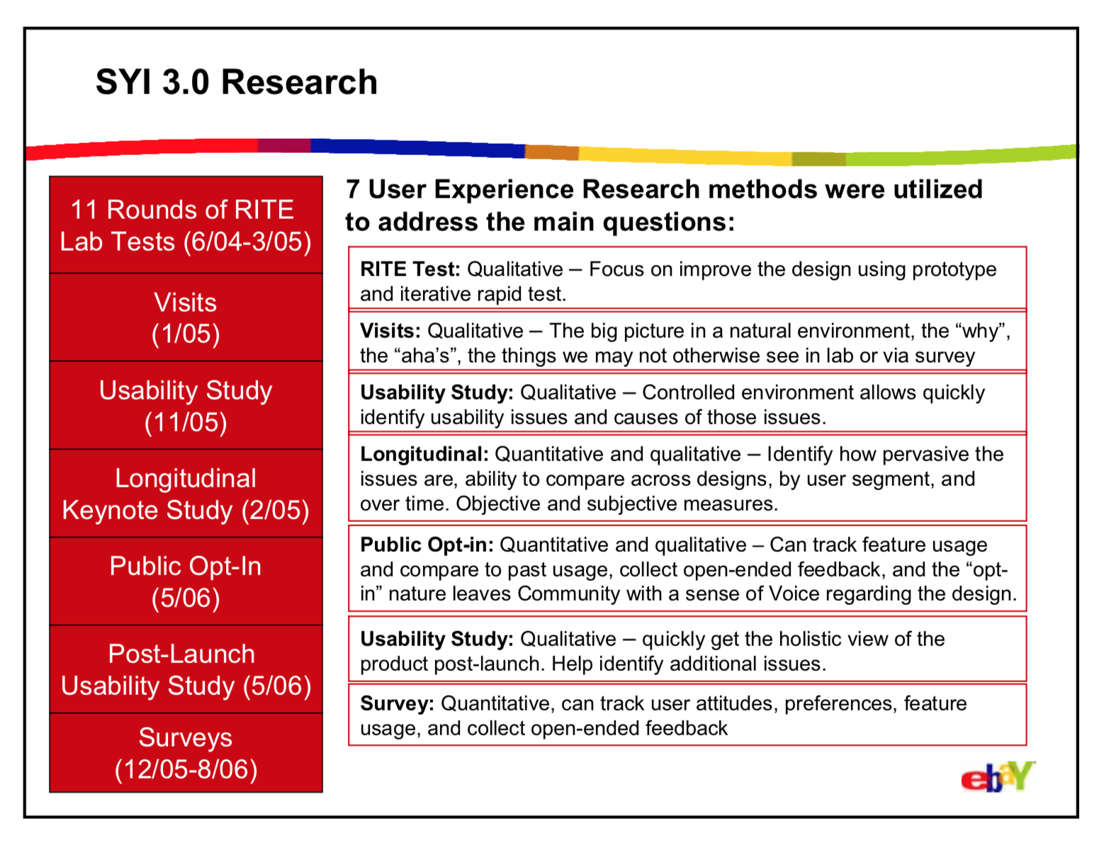
Throughout the process, user research guided our efforts. We spent many hours on the other side of the one-way glass being humbled, surprised, and sparked to come up with better alternatives.

High-level approach
Some notes on what I was aiming for as I worked on the content.
New UI and Help patterns
A set of newly designed patterns served as the building blocks of each page. This (mercifully) constrained the amount and types of content that the seller could see at any given moment.
To deliver more information that users might need, we created two new help elements:
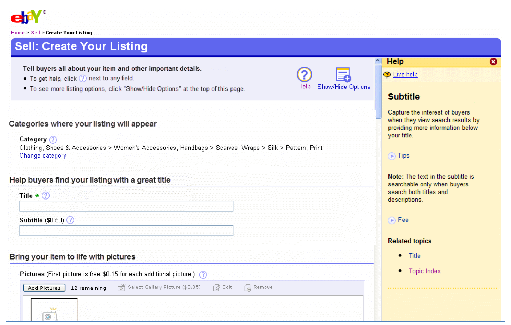
Bubble help pops up when a user clicks a question mark icon next to a field or option. It has space for a sentence or two and can be used to show the most essential information, such as a definition or quick answer to the most frequently asked question.
In-frame help appears on the right-hand side of a page when users click the big question mark icon at the top of any page, or when they click a “More help” link within an instance of bubble help. The in-frame help enables us to elaborate on a feature and accommodates 80-100 words. The help topic that’s shown automatically based on which field is active—it follows users along as they move through the flow.
Labeling the IA
The IA of the flow was essentially three levels deep: pages, sections, fields.
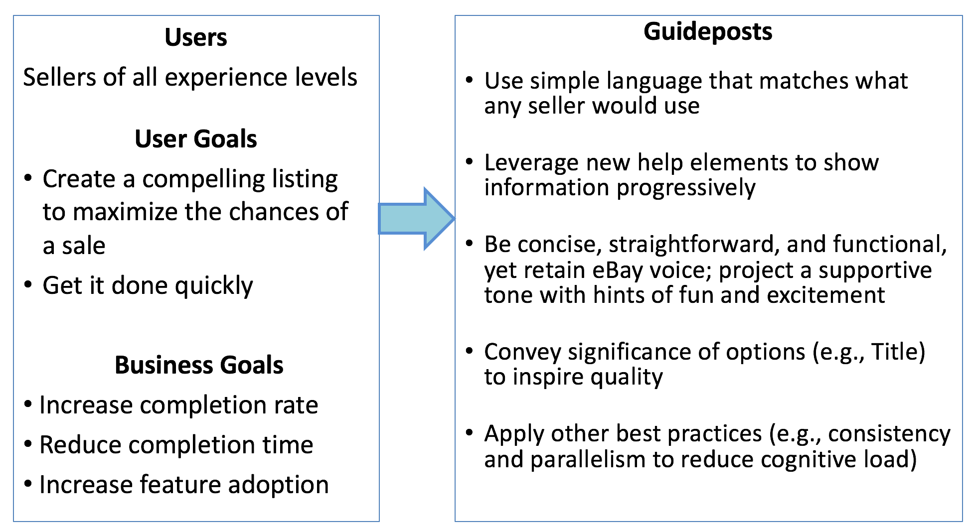
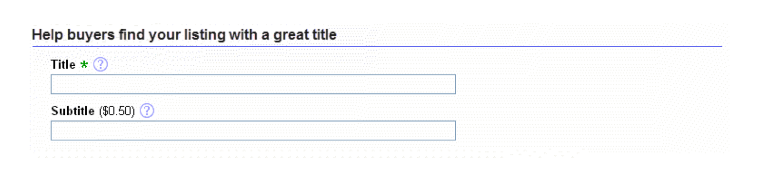
Page titles: Calls to action that reflected the purpose of each page (e.g., “Create Your Listing”)
Sections: At first I tried object/noun-based headings to describe the contents (e.g., “Pictures”). They were concise and easy for eyes to scan, but it felt like something was missing from the experience.
Given that the low-level field labels would be concise, I played around with more descriptive, conversational calls to action (e.g., “Bring your item to life with pictures”). This was an attempt to bring in a more engaging, human, guiding tone that captures some of the excitement of putting an item out to the world and connecting with buyers.
Lower-level content
Once the overall framework was solid, I focused on making concise field and option labels that could stand on their own without the clutter of extra text.
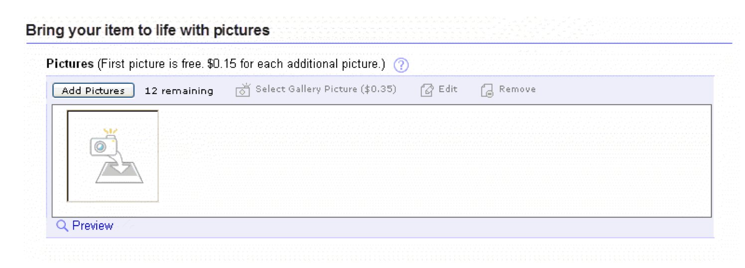
Some types of information, such as fees, were always shown up front.
Each item had its own little challenges, and not everything was consistent. In the payment methods section, there was a strong business motivation to encourage sellers to choose PayPal. I worked with partners from the PayPal business unit to come up with a simple label for the checkbox that would be functional yet get across the value of adoption.
Layering Help
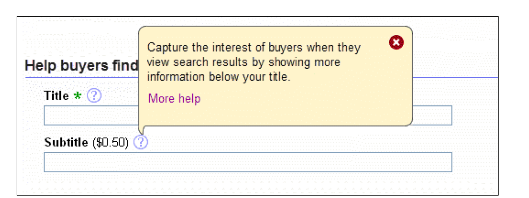
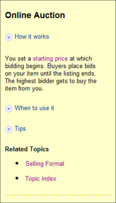
One of my tasks was to show help content using the bubble and in-frame help components. I tried to include the most essential points in the bubble help (a sentence or two) and more information in the in-frame help. However, even the space in the in-frame help area was pretty limited (~80 words), so I had to use whatever information and input I could get (user feedback, subject matter experts, etc.) to decide which information to include and what to leave out. This example shows the content about the Subtitle option.
Examples of in-frame help
With space and users’ attention spans limited, I used the following techniques to make the pages more digestible and scannable:
Recurring categories with consistent labels (“How it works,” “Requirements,” “Tips,” etc.).
Expanding/collapsing sections
Unfortunately the implementation didn’t turn out as I envisioned—there was too much space between a section header and its text.Use of bold within paragraphs to highlight key points
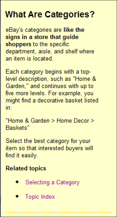
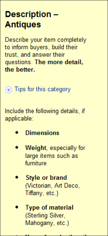
Category-specific tips based on input from subject matter experts
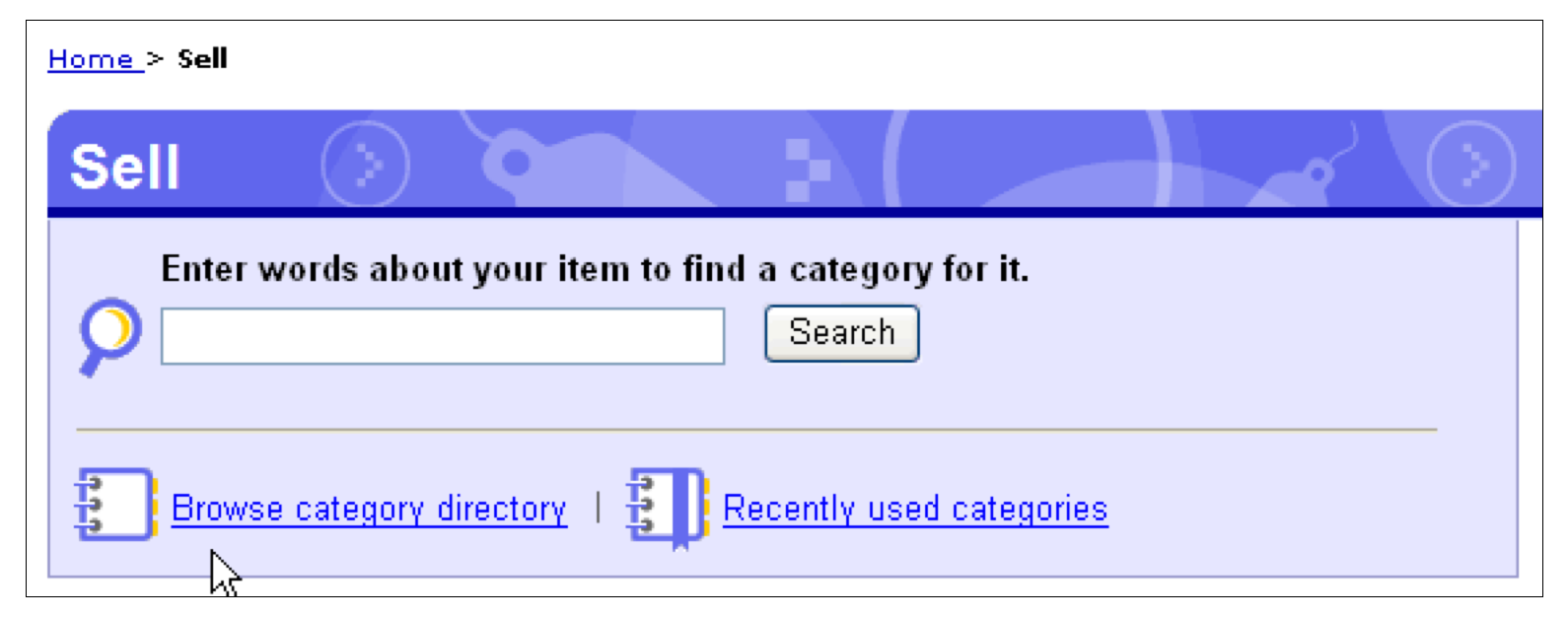
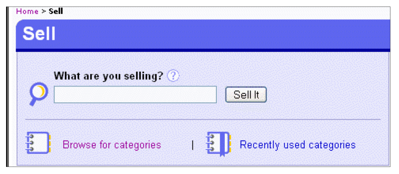
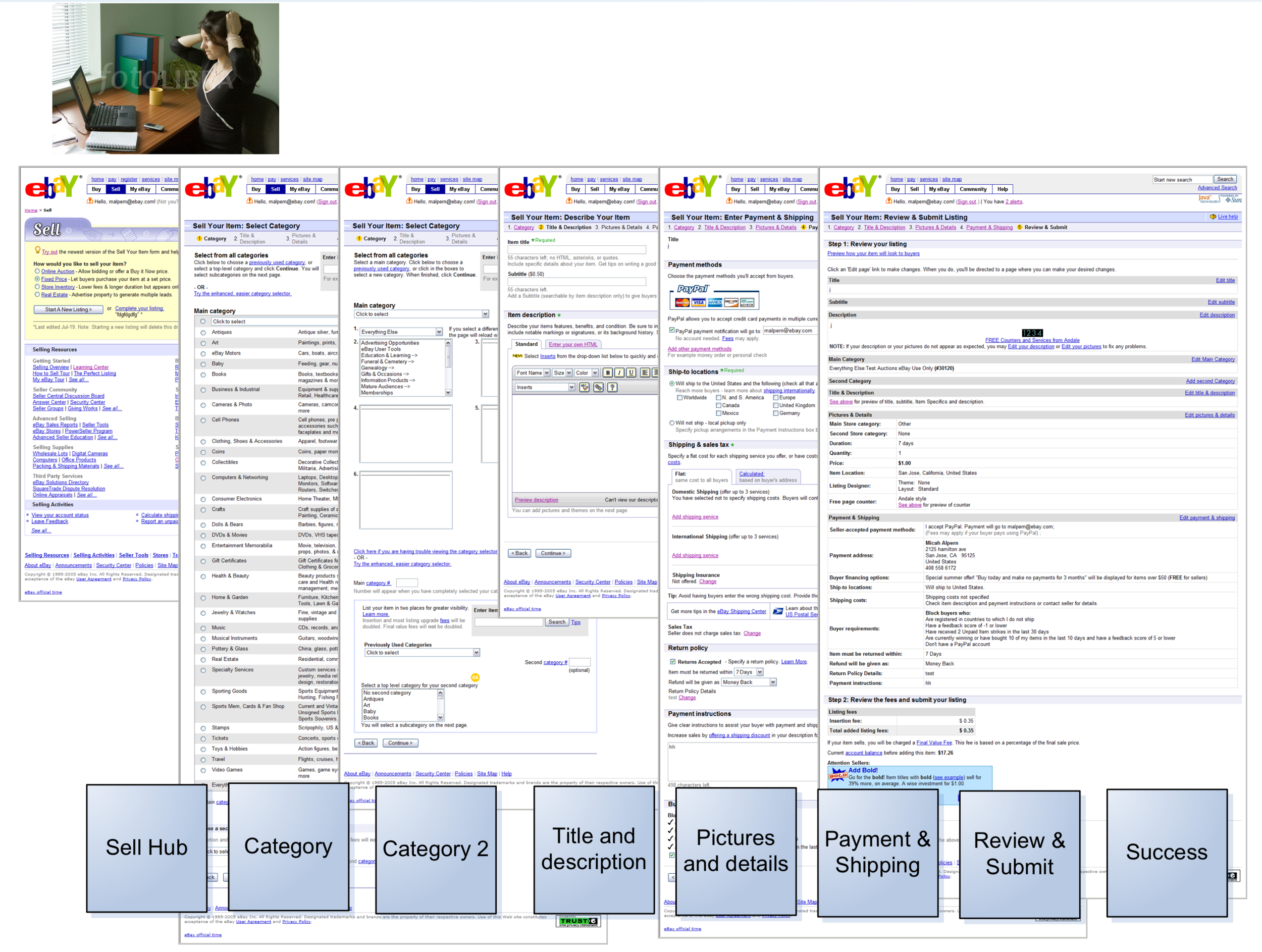
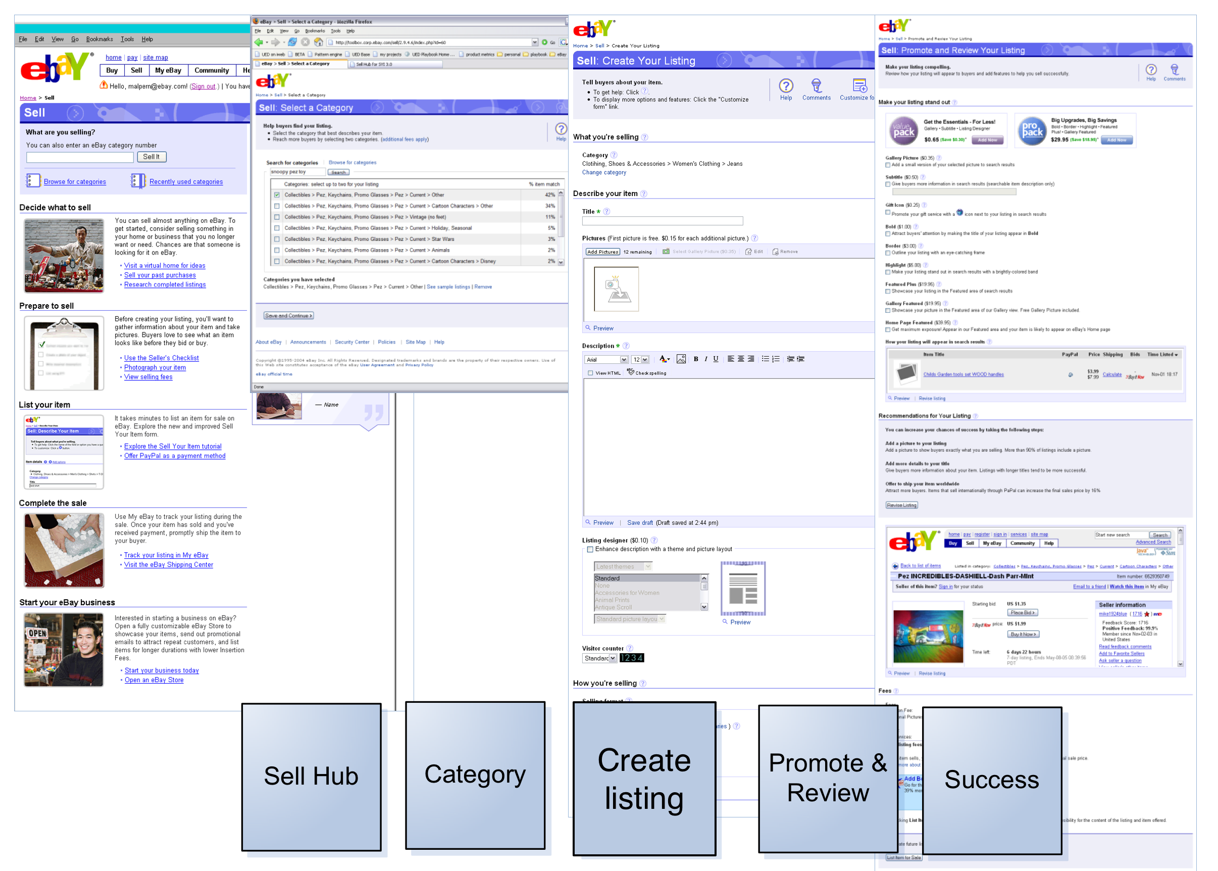
Before and after: Sell hub
Sellers start the a listing by entering a few words that describe the item they’re selling (e.g., “Star Wars action figure”) so that eBay can suggest a category for the listing.
In the “before” version, it wasn’t clear to users that this was the actual place where you start to list an item for sale, and the purpose of finding a category wasn’t clear to new sellers. I recommended “What are you selling?”—a simple, conversational, engaging question that would elicit the desired behavior—and “Sell It” for the button label, a stronger indication that this was the place to start the selling process.
Slide from presentation by Christian Rohrer (then Director of eBay UER) at UIE Web App Summit, January 23, 2007.
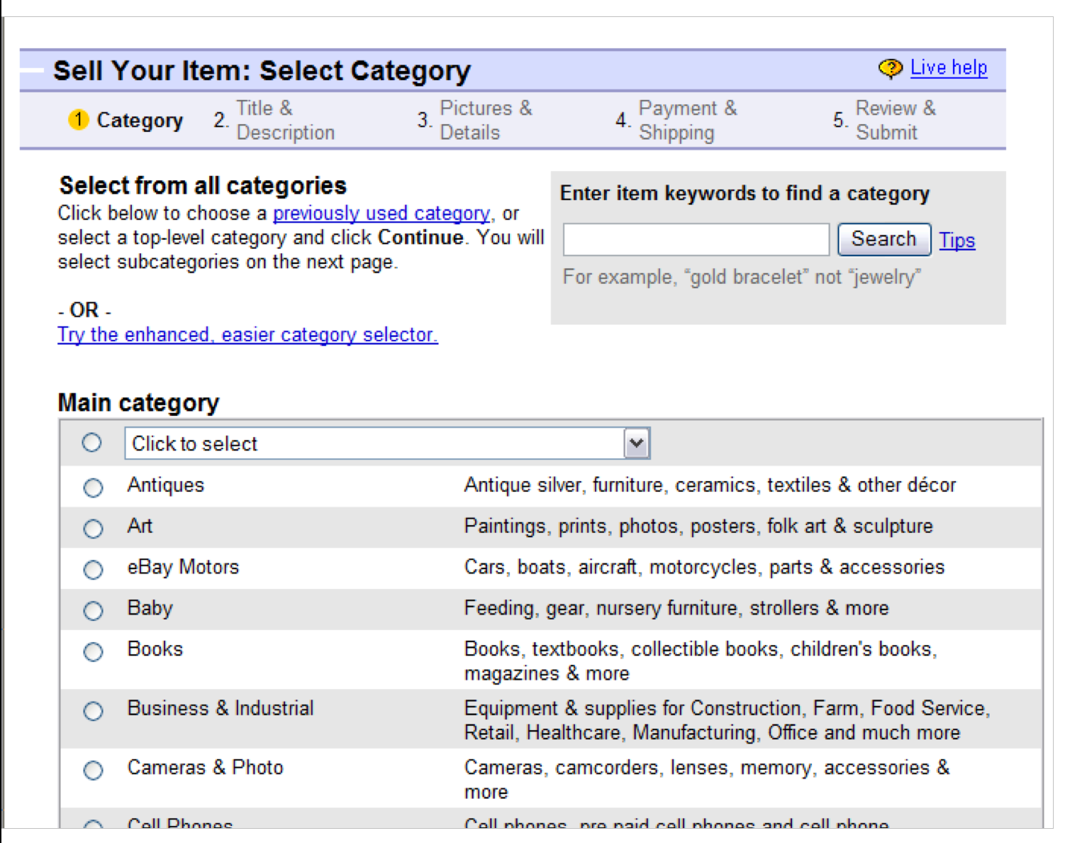
Before and after: Category selector
Analytics showed that the biggest drop-off in the old flow happened on the pages to select a category. Sellers regarded the task as laborious and confusing, and new sellers didn’t understand its role in their success.
The new design featured a different category selection widget, which made the task more intuitive and efficient.
Content-wise, the “before” version didn’t stress the purpose and value of choosing an appropriate category. I made sure that the instructions near the top of the page spoke to the importance of the task and to the value of choosing a second category, which could help drive more adoption of this feature (and revenue for the business).
Slide from presentation by Christian Rohrer (then Director of eBay UER) at UIE Web App Summit, January 23, 2007.
Yay!
“…better content, better help…”
Slide from presentation by Christian Rohrer (then Director of eBay UER) at UIE Web App Summit, January 23, 2007.